Elements
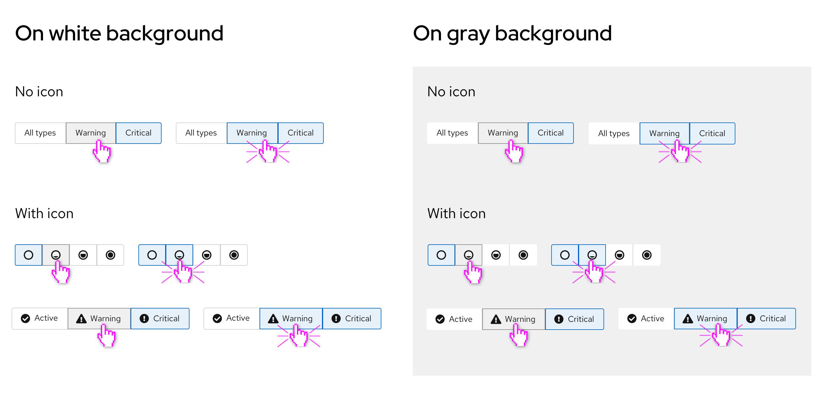
Toggle items can consist of icons, text, or both. Styling of toggles is dependent on the background color.
Usage
Toggle groups can be used when the user must select a single choice from a mutually exclusive set of options and can be used with or without icons. Use cases also vary depending on variation.
Variations
- Single select toggle group: Use to toggle between multiple items
- Multi select toggle group: Use to select multiple attributes
- Toggle items: Use to select a single action
Single select toggle group
Use single select toggle groups when you want to toggle between multiple items. There are many use cases where this can apply, such as:
- Selecting a single action within a group of actions (this can be useful for topology or similar canvas views)
- Toggling between multiple views
- Filtering by a specific value within a filter group
Examples
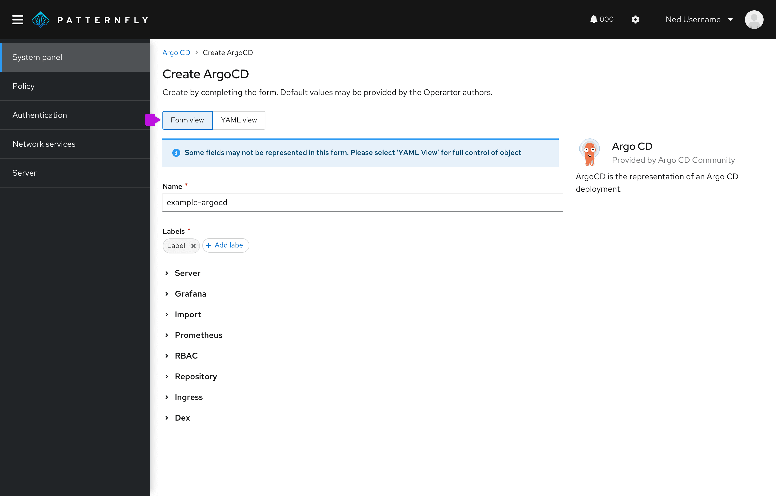
Single select toggle groups are commonly used to switch between views including:
- a form view and a YAML view
- a card view and a table view
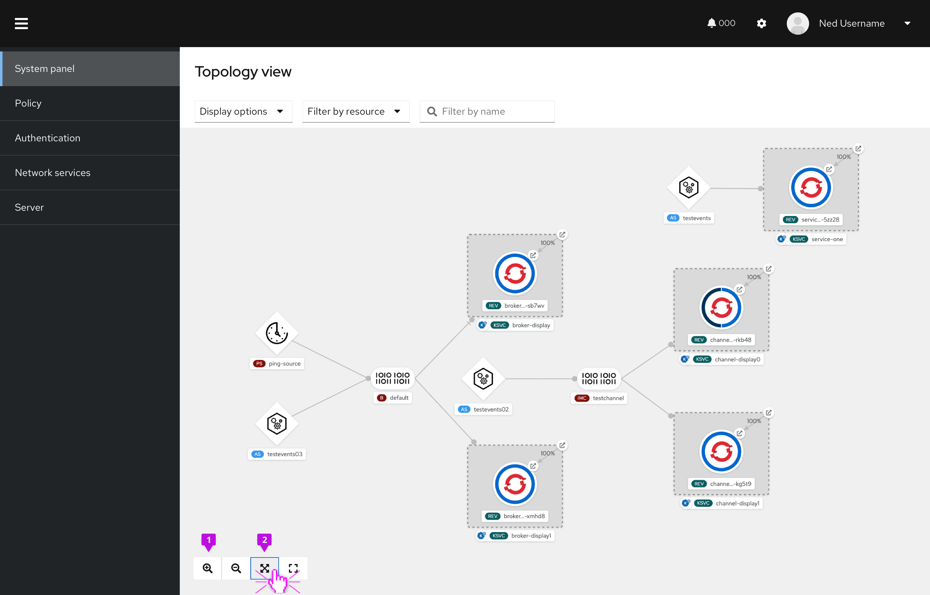
- Zoom in: By selecting this action, the view would zoom in by one increment.
- Fit to screen: This action will fit the topology view to screen. After selection, the item will return to its default state, with a white background.
Multi select toggle group
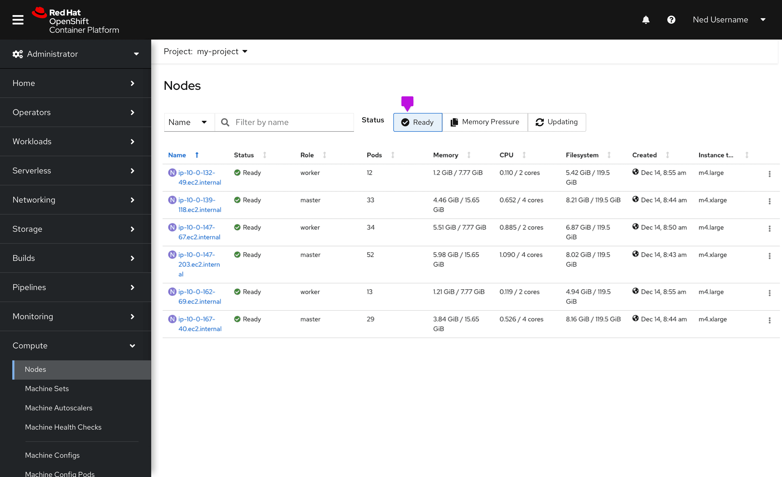
Use single multi select toggle groups when you want to select multiple attributes from a group. This is most commonly used for filtering a content view when there is a lot of space available.
Examples
Selecting an attribute will apply that filter to the table. In this case, only nodes that are “ready” are shown.
Toggle items
Use toggle items when you want to select a single action from a group. We recommend using toggle items when you want to switch the user into a specific “mode”. They look and act similarly to buttons.
Examples
Toggle items are most commonly used in canvas views, such as topology. Selecting a toggle item will switch the user into that “mode” or allow them to take that action.
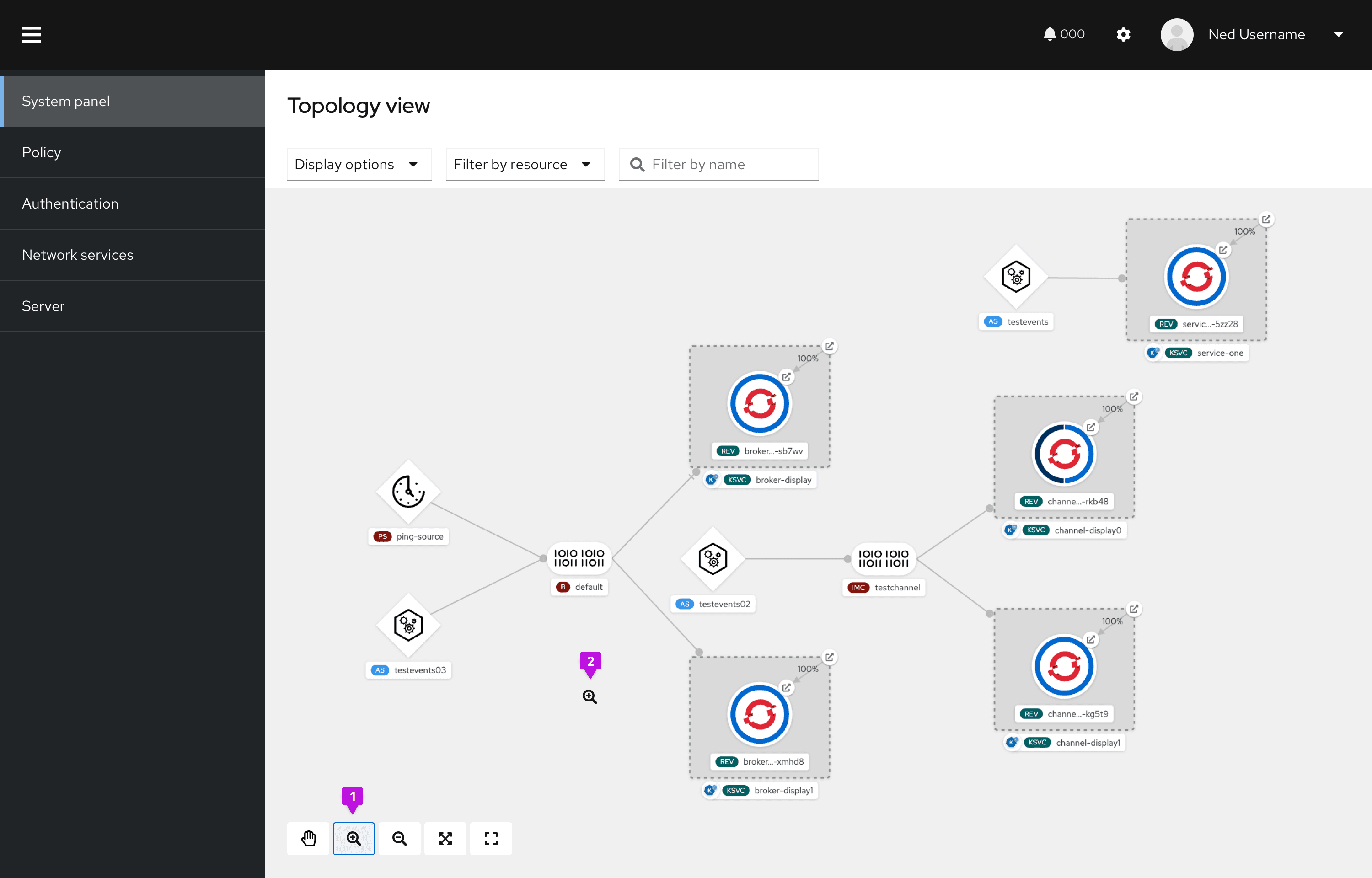
- Zoom in: This item changes the cursor into a zoom icon and allows the user to zoom, as long as that toggle is selected.
- Zoom cursor: The cursor changes into a zoom icon and the user may exit that mode by selecting the “move” hand toggle item.
View source on GitHub

